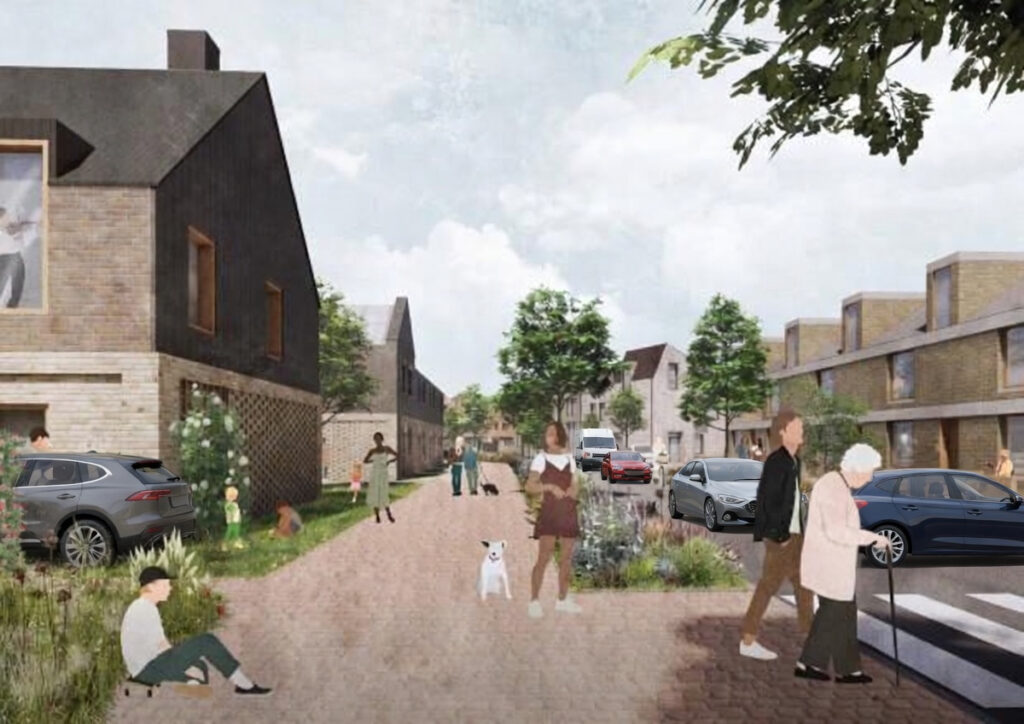
Whenever large developments are proposed, the promotional images always look the same. Like this:

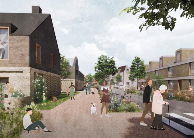
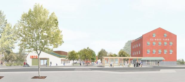
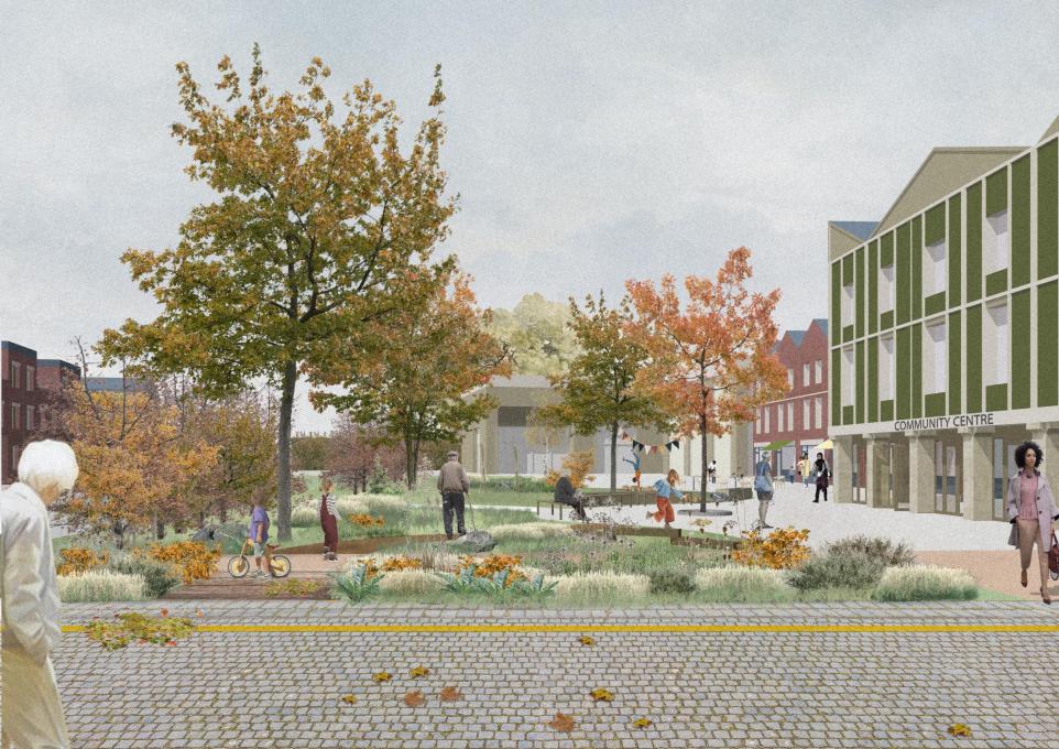

Wide streets. Trees everywhere. People walking. Cyclists riding through sunshine. Maybe someone pushing a pram or using a wheelchair.
What you never see are cars.
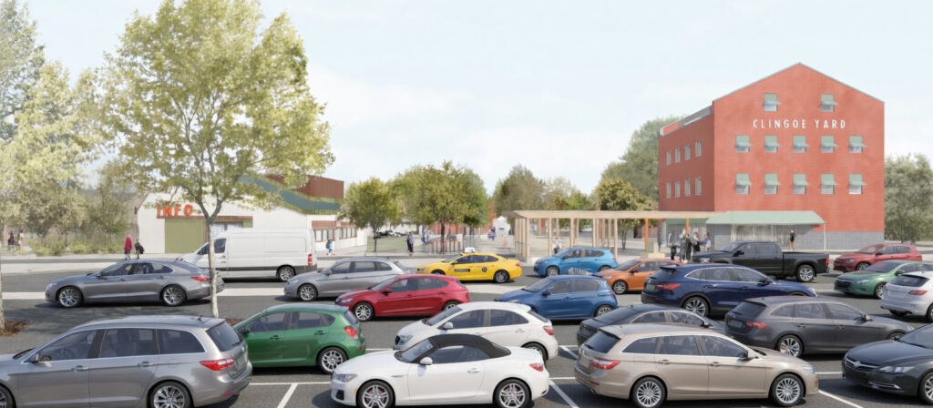
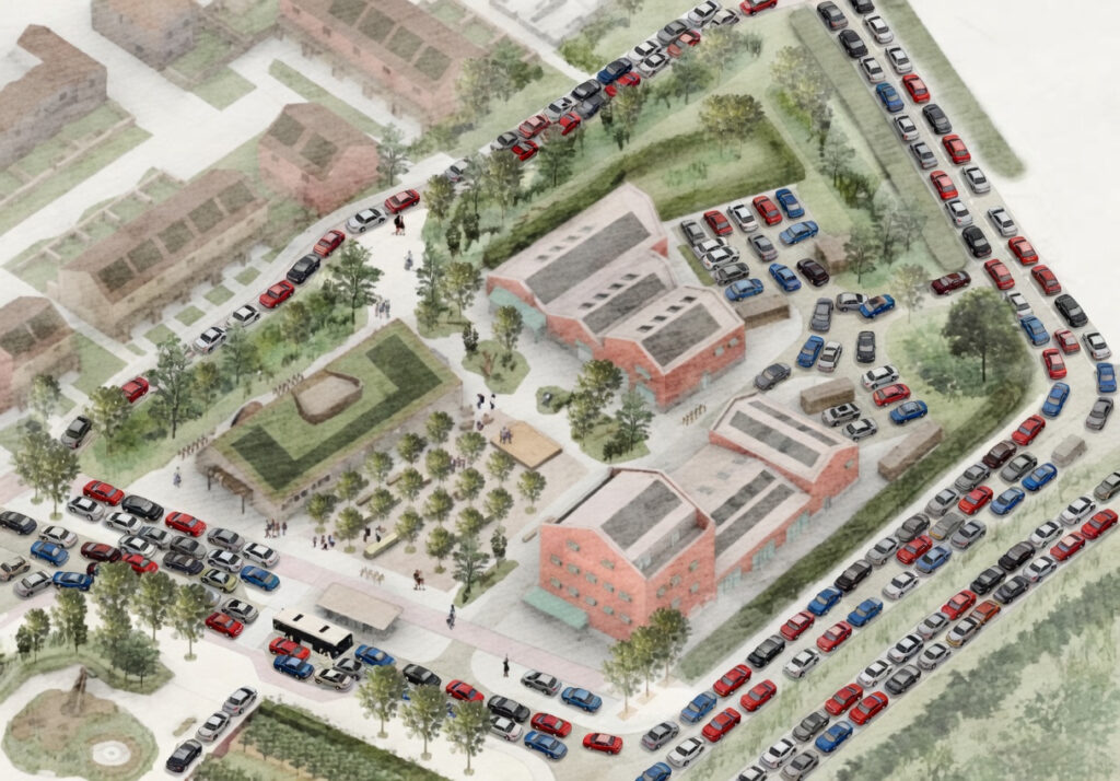
Yet in the real world, developments like this will obviously contain a lot of cars. People will commute. They will do school runs. They will go shopping. They will visit family. Especially in places like north Essex where most people still rely on their cars. Despite spending millions on a bus lane like on Clingoe Hill. Otherwise why spend tens of millions on the link road?
I am very supportive of active travel, I co-founded the Sunshine Coast Greenway as proof of that. Walking and cycling infrastructure should absolutely be part of good planning.
But shouldn’t the visualisations also reflect the real transport mix people will actually use?
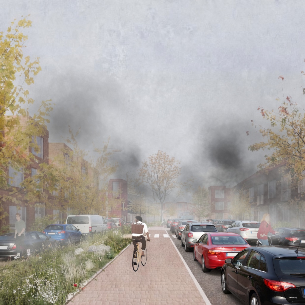
If developments are going to have significant car use, it would be far more honest and useful if the planning images reflected that reality rather than presenting a kind of traffic-free utopia.
Good planning should start with realism. Perhaps something more like these AI generated, but probably more realistic, versions: